Work · Analysis · 06
Manufacturing Cost Variance Dashboard
Budget versus actual across six cost categories, built for controllers who need the answer in one screen.
- Type
- Analysis
- When
- Qlik Sense · 2026
- Role
- Sole designer and developer. Data model, Python test layer, dashboard design.
- Scale
- 12 months · 6 cost categories · 2 product lines · 33 passing tests
In plain language
A controller's job when the monthly numbers land is to answer three questions fast: are we over budget, is it getting worse, and where is it coming from. Most variance dashboards answer either none of these (by showing everything at once) or only the first, by showing a single headline figure with no way to trace it. This one fixes a reading order: three questions, three regions of the screen, always in the same place.
The question
What does a controller actually do after seeing an unfavourable variance, and can the dashboard make that next step available without a filter change?
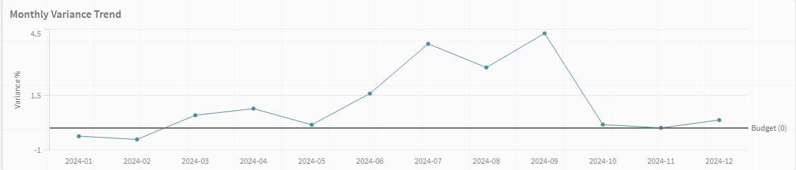
A controlling case study: twelve months of budget-versus-actual across six cost categories and two product lines, in Qlik Sense.
The design problem
Variance dashboards usually fail in one of two ways. They show every number, so nothing stands out. Or they show a single headline figure, so nobody can tell where it came from.
The layout here resolves that with a fixed reading order: a KPI strip answers “are we over or under, and by how much”, a monthly trend answers “is it getting worse”, and a category breakdown answers “where”. Three questions, three regions, always in the same place.
Data quality
The Python layer that builds the model carries 33 tests covering the variance arithmetic, the category rollups and the period boundaries. Financial reporting is exactly the situation where a silently wrong number is worse than a visibly broken dashboard.
What I took away
Most of the work was not in Qlik. It was in deciding what a controller actually does after seeing an unfavourable variance, and then making sure the next click was always available without a filter change.
How it is put together
Left to right, the path a request or a record takes through the system.
01
Model
- Python build layer
- Budget vs actual
- Category rollups
- Period boundaries
Where the correctness lives.
02
Test
- 33 tests
- Variance arithmetic
- Rollup consistency
A silently wrong number is worse than a visibly broken dashboard.
03
Load
- Qlik Sense data model
- 12 months, 6 categories, 2 lines
04
Read
- KPI strip: over or under, by how much
- Trend: is it getting worse
- Breakdown, where from
Fixed reading order, three questions.
What happens, step by step
In plain language, in the order it happens.
Build the model in Python, not in the BI tool
Budget-versus-actual arithmetic, category rollups and period boundaries are computed in a tested layer before Qlik ever sees them.
Test the arithmetic
33 tests cover the variance calculations, the rollups and the period edges. Financial reporting is exactly the situation where a silently wrong number does more damage than a dashboard that visibly fails to load.
Answer are we over, and by how much
A KPI strip in a fixed position at the top. This is the question that gets asked first, every month, without exception.
Answer is it getting worse
A monthly trend directly below, so the direction is visible without a click.
Answer where is it coming from
A category breakdown, reachable from the headline figure without changing a filter, because a controller who has to reconstruct their filter state to drill in will stop drilling in.
Decisions, and what they cost
Every choice worth recording has a road not taken. Both are here.
Compute variance in a tested Python layer
instead ofExpressions inside Qlik
Chart expressions are invisible to version control and impossible to unit test. Moving the arithmetic upstream means 33 tests can assert it, and the dashboard becomes a presentation layer over numbers that are already known to be right.
A fixed three-region reading order
instead ofA configurable dashboard
Variance dashboards fail either by showing every number, so nothing stands out, or by showing one figure nobody can trace. A fixed layout means the same question is answered in the same place every month, and recognition replaces searching.
Design around the next click
instead ofDesigning around the headline
The interesting question was not what to show first but what a controller does after seeing an unfavourable variance. Making that step always available without a filter change is most of the design work here.
What came out of it
- Twelve months of budget-versus-actual across six cost categories and two product lines.
- 33 passing tests over the variance arithmetic, rollups and period boundaries.
- Three questions, three fixed regions: the next step after a bad number never requires a filter change.
Still open
- The model is a controlling case study, not live company data, so the reading order is validated by design reasoning rather than by observed use.
- No drill-through to transaction level; the breakdown stops at category.
Built with
- Qlik Sense
- Python
- Data modelling
- KPI design